Nat Robinson

Live

Clip to Card

Clip to Card

Clip to Card

Turning myWaitrose vouchers from a top customer complaint into a one-scan experience

Role

Senior Product Designer — led product design on this project

Timeframe

Full clip-to-card rolled out by October 2024; select/deselect shipped as an earlier phased release

Team

App Designer (peer), UX Researcher, Developers, Product Owner, plus Product Owners from other impacted areas

Headline result

50% reduction in voucher-related verbatim complaints after the select/deselect release; customer satisfaction (CSAT) up 16% in the month of the full clip-to-card rollout

Overview

myWaitrose loyalty vouchers were among the top sources of customer complaints, driven by a convoluted experience: true “clip to card” — scanning all vouchers at once from a loyalty card — had proven too complex to build initially, so the scheme launched with an interim solution that required scanning vouchers one at a time.

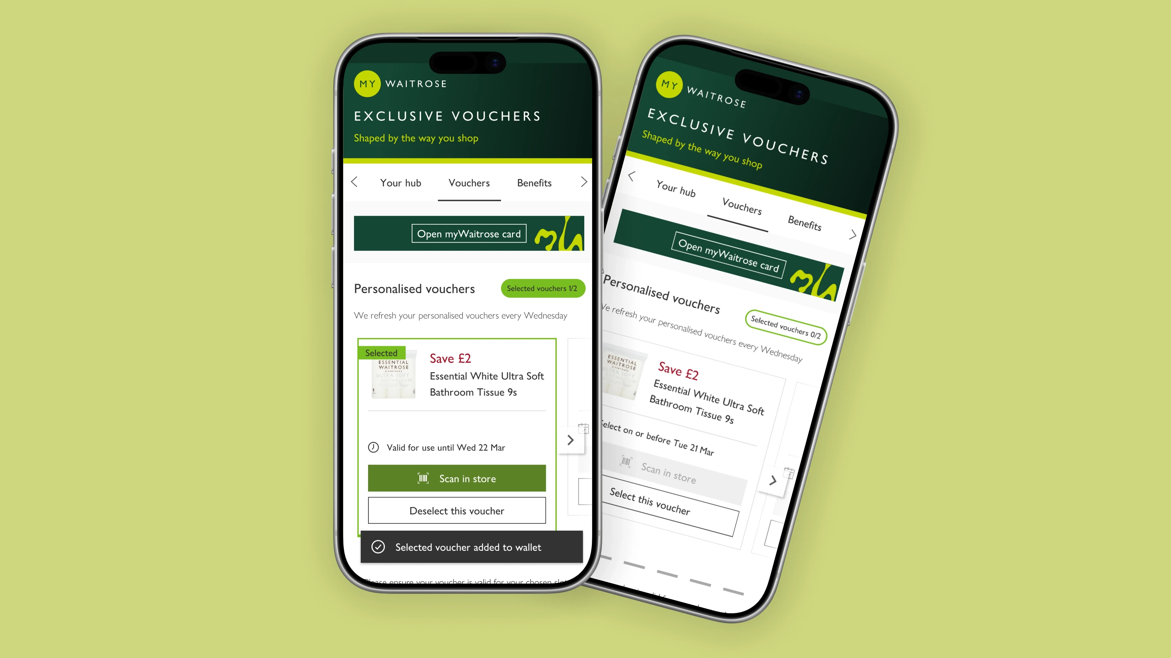
I led product design on the fix, owning the web experience while working in tandem with the app designer to keep the two platforms unified, alongside a UX Researcher and developers in an agile product team. Recognising that a full clip-to-card rebuild would take too long to deliver value, I made the call to split the work: shipping the most-requested piece — select/deselect — as a fast follow, while the full solution went through a longer phased rollout.

Objective

Create the functionality for all vouchers to be scanned from a customer’s loyalty card at once, instead of individually, to reduce customer frustration.

Target audience

myWaitrose customers using vouchers in-store and online, on both web and app.

The Problem

Because true clip-to-card functionality had proven too complex to build initially, customers were stuck scanning each voucher one at a time — convoluted enough that it became one of the most common sources of customer complaints, and, as testing later confirmed, was actively costing Waitrose engaged customers (see Testing below).

Goals

  • Deliver the ability to scan all vouchers at once from a loyalty card

  • Reduce the volume of customer complaints tied to the voucher experience

  • Keep the web and app experiences unified despite their different customer behaviours

Research

Methods

  • Analysis of customer feedback via the verbatim complaints channel, to understand pain points with vouchers

  • A panel with in-store staff, to understand the problem from a frontline perspective

  • Workshops with developers, to understand system restrictions and limitations before designing, so I could scope realistic options rather than designing solutions that couldn’t be built

Define

I mapped the experience across both happy and unhappy paths, treating in-store and online separately since their customer behaviours and user bases differed. I worked closely with the app product designer to align journeys where it made sense, and to deliberately diverge where the platforms needed different solutions. I brought in the Product Owner, developers, and Product Owners from other impacted areas early, specifically to surface requirements or restrictions I might otherwise have designed around blind.

Once I judged that delivering full clip-to-card in a reasonable timeframe wasn’t realistic, I proposed breaking the work into smaller deliverables. The first release I prioritised was:

  • Select/deselect functionality for vouchers — a feature customers had asked for almost as often as clip-to-card itself, and far cheaper to deliver

  • Horizontal scroll, introduced to support additional voucher types that wouldn’t fit the existing model

Design

I kicked off design with a Crazy 8s session alongside developers and the app designer, which surfaced problems the team hadn’t previously considered.

From there, I refined those ideas into wireframes for the Product Owner, then built high-fidelity visuals and components in Figma, with prototypes covering specific customer scenarios and screen sizes.

Because research told us web customers skewed less tech-savvy than app customers, I made a deliberate call to prioritise clarity and discoverability in the web designs over the more gesture-reliant patterns that worked fine on app — favouring explicit, visible controls rather than assuming customers would find hidden interactions.

Testing

Usability testing

I tested the full clip-to-card experience via Figma prototypes remotely with 10 customers across web and app, plus ran a guerilla testing session in-store for mobile web and app with a further 10 customers. Testing both online and in-store customers was essential, since their behaviours and customer base differed.

Findings

  • Confirmed the tech-savviness gap between web and app customers, validating the simpler web design approach

  • 4 in 10 customers in the in-store session reported they’d become lapsed users of the myWaitrose voucher proposition specifically because of the lack of clip-to-card functionality — turning “customer frustration” into a measurable retention risk, and strengthening the case for prioritising this work

Iterations

  • Added a glimpse of the next voucher in the carousel, since some customers didn’t intuitively think to scroll

  • Added a more prominent CTA on mobile web for the myWaitrose card itself, which also needs scanning alongside vouchers

Implementation

Development collaboration

Developers supported early design work by mocking up HTML prototypes of specific features, such as the horizontal scroll, helping validate feasibility before full build. I sat in on refinement sessions throughout, and was present for all QA sign-offs to make sure what shipped matched the intended experience.

Design handoff

Handover was a well-annotated Figma file, supported by ongoing refinement sessions with the development team rather than a single handoff moment.

Results

Outcomes

The select/deselect functionality and horizontal scroll shipped successfully as a fast follow. The full clip-to-card solution completed its phased rollout by October 2024, and now sits with a different team as business-as-usual.

Impact

  • 50% reduction in voucher-related verbatim complaints following the select/deselect release

  • CSAT up 16% in the month the full clip-to-card rollout completed

Beyond the immediate brief

The research done for this project surfaced other areas where the wider voucher proposition was falling short of customer expectations. I made sure these findings didn’t just sit in a deck — they were collected and fed back to the CRM and Marketing teams who manage voucher campaigns, extending this project’s impact beyond its original scope.

Reflection

Lessons learned

Splitting a large, technically complex ask into a smaller, high-value first release (select/deselect) rather than waiting for the full solution meant customers felt the benefit months earlier — and gave the team a concrete, low-risk win to build momentum on before tackling the harder problem.

Future improvements

The proposition-level findings handed to CRM and Marketing point to further opportunities beyond this project’s scope, now owned by other teams.

Nat Robinson — Senior Product Designer