In progress

Contact Us

Aligning business and customer needs to make getting help easier

Role

Lead Product Designer

Timeframe

2025–2026

Team

Product Owner, Developers, UX Researchers, Copywriter

Headline result

[X hours/week saved in query filtering] · [X% improvement in first-contact resolution]

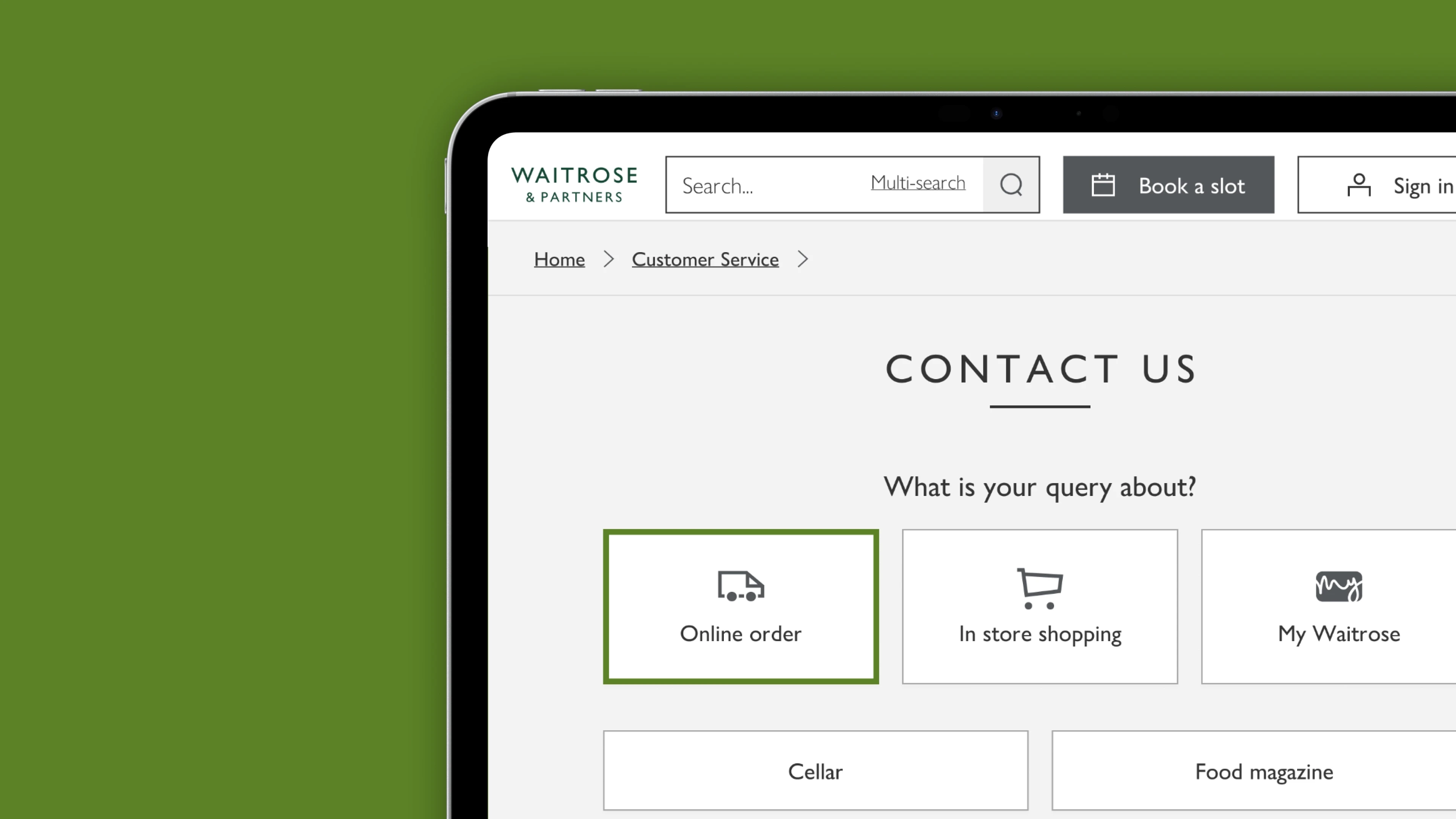
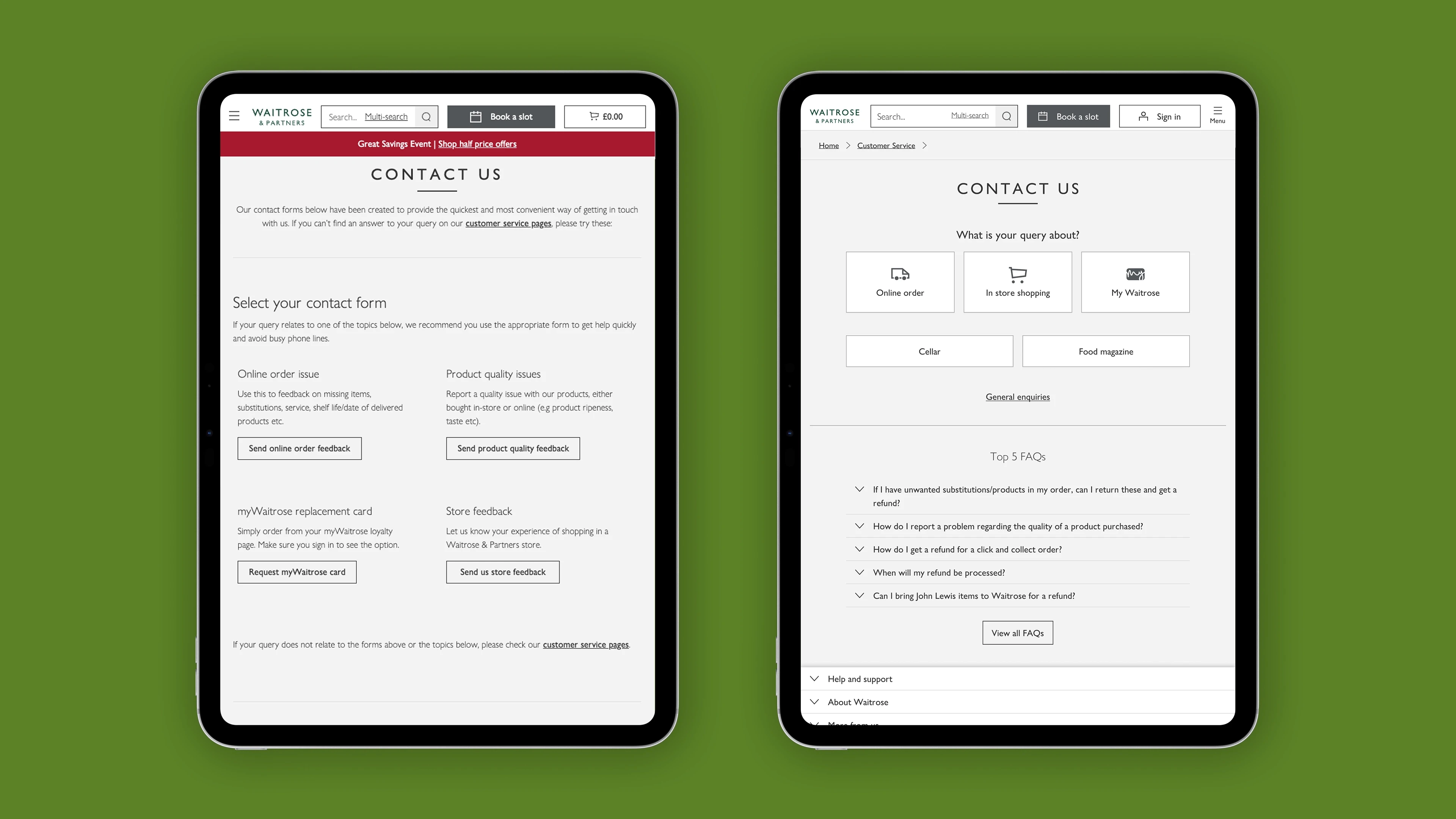
Hero shot — polished screen of the final “Contact Us” hub or triage flow

Overview

Waitrose customers who ran into a problem — a missing item, a late order, a faulty product — often didn’t know where to go to get it fixed. That confusion didn’t just cost customers time; it cost Customer Care hours of manual triage every week, and meant a meaningful share of queries couldn’t be resolved on the first contact.

As Lead Product Designer, I worked with a Product Owner, developers, UX researchers and a copywriter to redesign how customers found and used contact routes — improving what information was collected up front and how options were signposted, so that both customers and agents spent less time going back and forth.

Objective

Improve the contacts Customer Care receive from customers so that queries can be resolved more efficiently.

Target audience

Customers and Customer Care agents.

The Problem

Customers didn’t know which form or contact method to use when something went wrong. Without clear signposting, they’d guess — often picking the wrong route, leaving out information agents needed, or contacting Customer Care multiple times for the same issue.

Impact

  • [35] hours a week spent manually filtering and re-routing customer queries

  • [X]% of queries couldn’t be resolved within the initial contact

Goals

  • Reduce the hours per week spent filtering queries

  • Reduce the number of queries that require more than one contact to resolve

  • Achieve both by improving the information collected from customers up front and improving signposting to the right route

Research

To understand where the experience was breaking down, I ran a mixed-methods research phase across both sides of the conversation — the customers submitting queries and the agents handling them.

Methods

  • Data analysis of Customer Care contact volumes and categories

  • Interviews with Customer Care agents

  • Interviews with customers about their “as is” experience

  • Guerilla testing with peers

  • Stakeholder interviews

  • Competitor analysis

Participants

Customer Care agents, and customers who had placed [X] online shops within the last [X months].

Key findings

No one knew where to submit order issues, and the failure rate on first contact was considerable.

Journey mapping

I mapped the journeys generating the highest volume of contacts and the lowest one-contact-resolution rates, flagging friction points along the way.

Journey map highlighting high-contact / low-resolution touchpoints

Ideation

Brainstorming

I ran a workshop with stakeholders to align on problem statements, generate How-Might-We questions, and agree the project’s design principles.

Workshop photo, whiteboard, or How-Might-We / design principles output

Concept development

I prioritised flows for the most complicated journeys first, since they were most critical to the project’s success, then mapped the remaining journeys and edge cases. These were presented back to stakeholders for alignment.

Wireframes

I created wireframes to test the feasibility of routing customers through a triage system before committing to detailed design.

Early wireframes of the triage flow

Design

Low-fi prototypes

Used to test whether the proposed flows would work within the existing design system, and to identify where new components would be needed.

Feedback and iteration

The designs went through several rounds of iteration in working sessions with stakeholders, to make sure their pain points were reflected alongside the customer’s.

Hi-fi prototypes

Built for usability testing.

Hi-fi prototype screens

Visual design

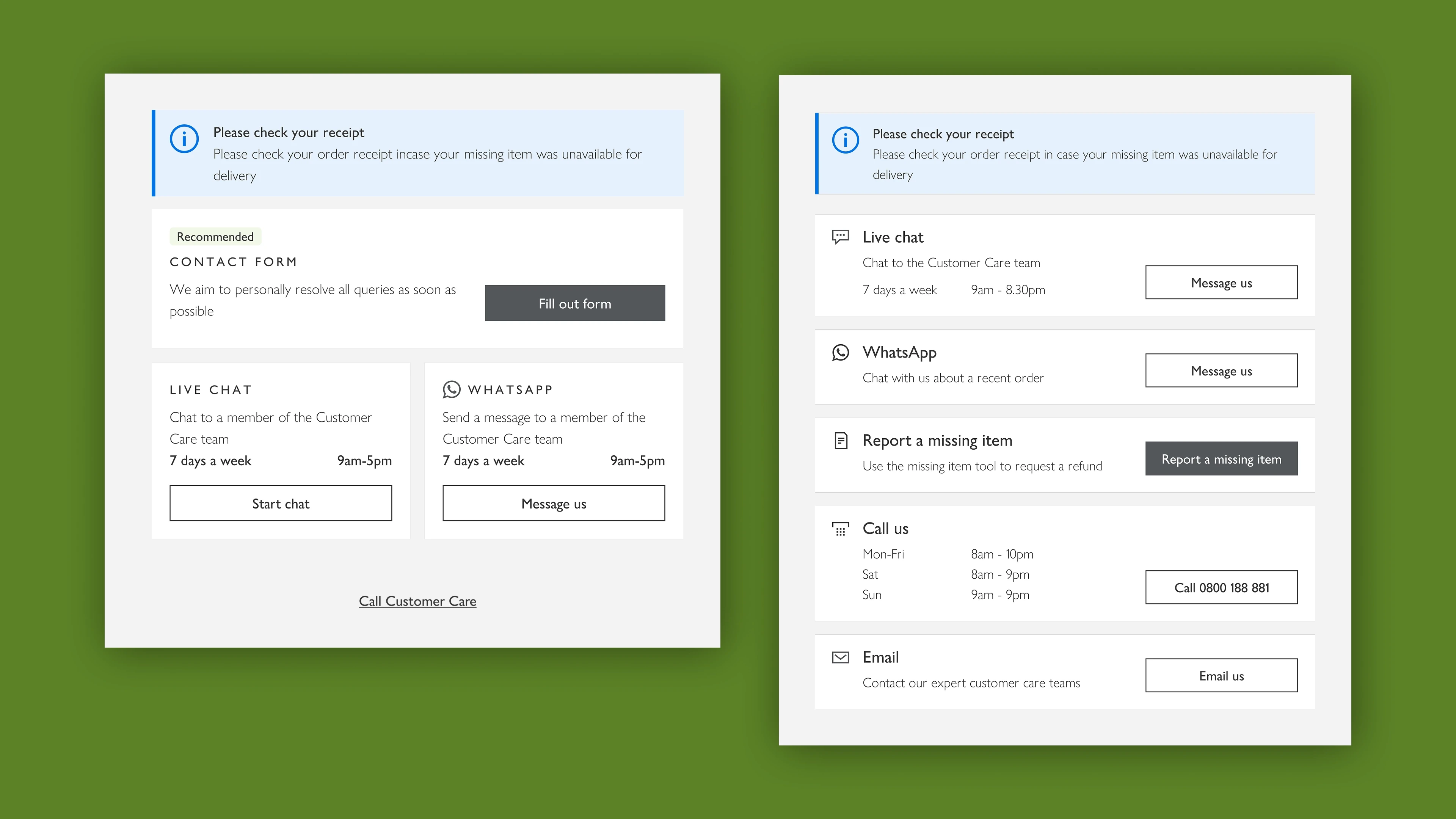
I created a new pattern for high-level categories to improve visual hierarchy for customers trying to find support, and an improved pattern for displaying contact options.

Before/after comparison of the category and contact-options patterns

Testing

Usability testing

Worked with a UX researcher to structure the test plan and conduct sessions with [X] participants.

Participants

Customers who had placed [X] online shops within the last [X months].

Findings

Customer confidence in finding and completing the correct form improved significantly.

“[insert customer quote]”

Iterations

[What changed as a result of testing? e.g. any flows reworked, copy changed, components added]

Implementation

Development collaboration

[How closely did you work with developers during build — pairing, reviewing in sprint, QA on live builds?]

Design handoff

[What did handoff look like — specs, design system contributions, documentation?]

Results

Outcomes

[What launched, and when?]

Impact

[Headline metrics — hours/week saved, % change in first-contact resolution, contact volume change, CSAT if available]

User feedback

[Any post-launch customer or agent feedback?]

Results chart/dashboard — before vs after

Reflection

Lessons learned

[What would you do differently, or what surprised you?]

Future improvements

[What’s next for this flow — e.g. is this where Self Service Refunds grew out of?]

Links and references

[Prototype link / design file / related case studies — e.g. link to your Self Service Refunds case study, since it grew out of this project]

Nat Robinson — Senior Product Designer