Live

WISMO (Where Is My Order)

Bringing web and app order tracking into alignment, with accessibility at the core

Role

Lead Product Designer

Timeframe

Core work March–June 2024, live October 2025, with iterations ongoing

Team

User Researcher, UX Writer, multiple agile product teams (touched 15 teams, starting with Doorstep & Delivery)

Headline result

Delivery tracking contacts down 19%, late delivery contacts down 33% in the first week post-launch

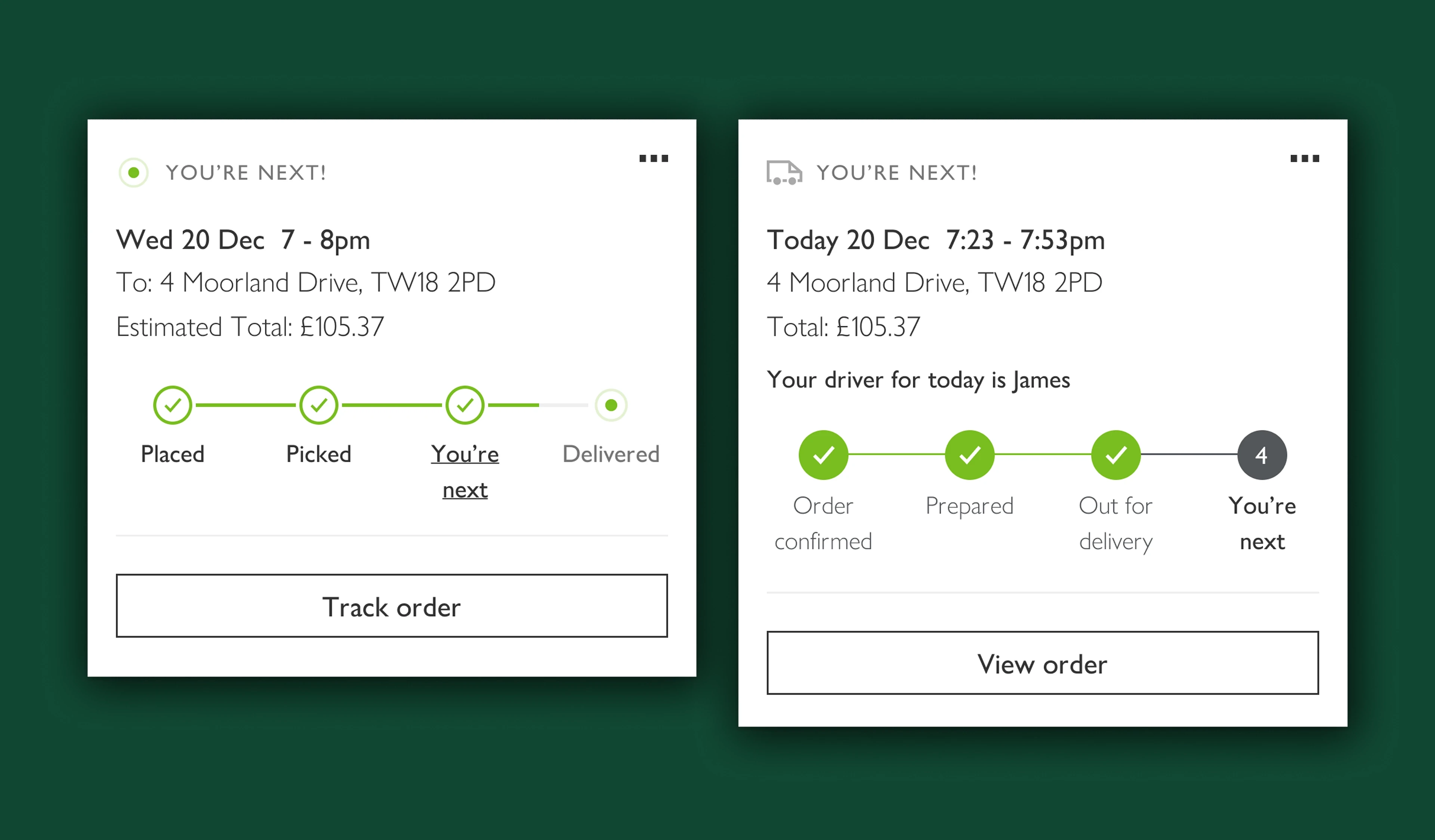
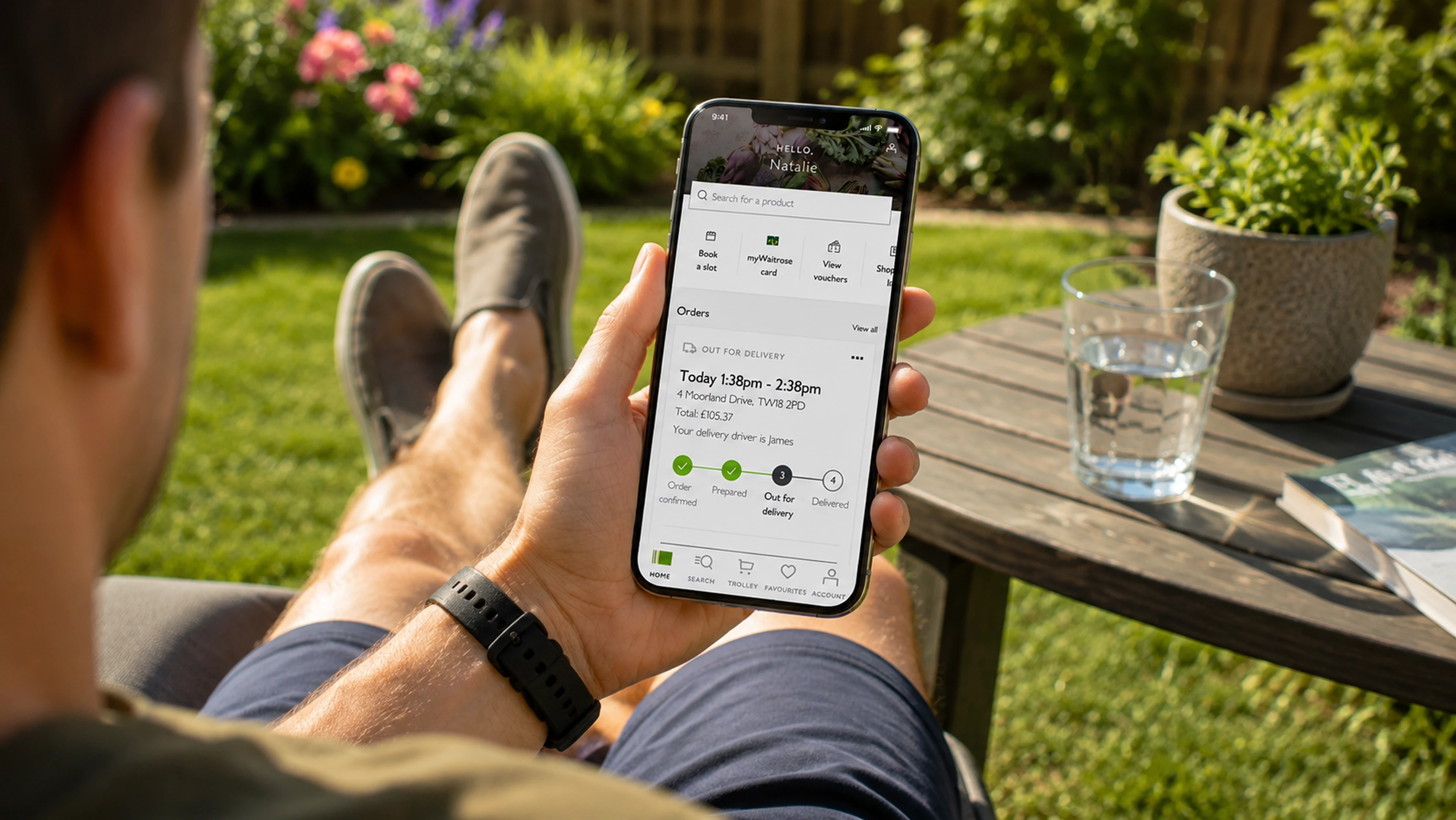
Hero shot — the redesigned order tracking card/step tracker on web or app

Overview

Grocery orders only became part of Waitrose around the pandemic, and in the time since, order tracking had stayed disjointed — tracking only existed on the app, leaving a lot of customers relying solely on email and text updates. That gap caused confusion and frustration, especially when orders ran late.

As Lead Product Designer, I owned the web experience, the accessibility enhancements on app, and improvements to customer communications — working closely with a User Researcher, a UX Writer, and multiple agile product teams to bring web and app into alignment.

Objective

Enhance the order tracking experience by introducing new functionality, improving existing features, and prioritising accessibility.

Target audience

Customers tracking an active grocery order, across web and app.

The Problem

Order tracking only existed on the Waitrose app, so a large share of customers depended entirely on email and text for updates — a channel that couldn’t offer the same clarity or immediacy. This created confusion and frustration, particularly around delayed orders, and left web customers with a noticeably weaker experience than app customers.

Goals

  • Bring the web and app tracking experience into alignment

  • Reduce confusion and frustration around order status, especially for delayed orders

  • Build accessibility into the core experience rather than retrofitting it

Research

Discovery made up a large part of this project — getting the communications right depended on it.

Methods

  • Analysis of customer verbatim from previous surveys, to identify themes and patterns related to deliveries

  • Engagement with the Customer Service team, to understand the key reasons customers were contacting them about grocery orders

  • Competitor analysis across grocery competitors’ communications, web and app journeys, plus non-grocery delivery services (DHL, Deliveroo, Yodel), to establish a baseline to match and beat

  • Data analysis of ordering habits, notification preferences, and email open rates, to identify which communications were most valuable

  • Customer interviews on communication preferences — message type and timeliness

Key findings — customer verbatim themes

  • More communication wanted throughout the delivery window

  • “Van is 15 minutes away” style alerts often arriving late or not at all

  • Deliveries running late with no prior warning

“The text saying the van is about to arrive generally arrives after the van has gone - today an hour and quarter later”

“Booked a delivery slot for 9am-10am and the delivery arrived 20 minutes late which disrupted my morning plans.”

“Delivery was 1 hour late without any previous warning”

“I wasn’t aware I could track my order on the app.”

Competitor benchmarking — grocery and non-grocery delivery tracking comparison

A research side-story

To properly compare the end-to-end customer experience of tracking a delivery, I had grocery orders delivered from Tesco, Sainsbury’s and Asda so I could document each journey firsthand. Rather than let the food go to waste, the wider product team clubbed together and donated it — 25.42kg of food and toiletries to the Trussell Trust, a foodbank charity Waitrose already partners with in-store.

Define

I refined the existing journey map for web and app, layering in the frustrations and sentiments surfaced during discovery, to present stakeholders with the key problems to solve. This is also where I identified that accessibility improvements — around language and visual style, especially on app — needed to be a core part of the project, not an afterthought.

Refined journey map with frustration points annotated

Design

I looked at the functionality and visual style used by competitors and sketched wireframes to work through options for the tracking experience. For the step tracker itself, I chose to reuse an existing pattern from the design system, since it had already tested well and met accessibility standards — prioritising proven patterns over new ones where it made sense.

For customer communications, I worked with the UX Writer to make sure the language matched what was actually happening with an order.

Key improvements

  • Thanks to improved tracking software, delivery windows were reduced to as little as half an hour — one of the project’s main feature enhancements

  • Date formats changed from specific dates (e.g. “Wednesday 5th July”) to relative terms like “Arriving today” or “Arriving tomorrow” once the date fell within range, reducing cognitive load

  • Pulsing status animations were removed from the app’s order card component — current accessibility standards require animations to include a pause control or stop after 5 seconds, and the pulsing added nothing to the experience

  • Tracker colours were updated to meet AA accessibility ratings

Before/after of the order card component — old animated version vs. new accessible version

Testing

Usability testing

Working with a User Researcher, I co-wrote the testing plan and interviewed participants who were asked to imagine they had an active Waitrose order. To check nothing was missed end-to-end, some of the earlier communications-preference questions were repeated during these sessions.

Two rounds of testing ran in parallel:

Moderated interviews — 5 participants

  • All had completed at least one online Waitrose purchase within the last 3 weeks, with home delivery (not click & collect)

  • At least 3 received Waitrose deliveries at least once a month over the last 3 months

  • At least 3 had received app notifications to track an order

  • All or most had received an online delivery from a competitor within the last 2 months

  • Some were regular users of convenience apps (Just Eat, Deliveroo, Uber Eats) at least fortnightly, or had used one in the last 2 weeks

Hotjar survey — 412 participants

  • All shopped online with Waitrose at least twice a month

  • All had received a Waitrose delivery within the last 2 weeks

  • 92% had an order confirmed and due for delivery

  • Surveyed on the Order Confirmation page (for those who’d just booked) and the GLP page

Findings

Beyond the tracker changes, testing surfaced an internal process gap — Waitrose has documented Branch Operating Processes (BOP), but in practice branches often operated outside of them, contributing to the inconsistency customers were experiencing.

Iterations

Based on what was observed in testing, I changed where a couple of the steps updated on the tracker, to improve clarity and reduce confusion about what each step meant. Separately, when Microlise — the tracking service several delivery companies relied on, including one thought unlikely to ever go down — suffered an outage, it prompted a rethink of the messaging used for service-down announcements going forward.

Implementation

Development collaboration

I stayed closely involved with development through to launch and beyond, sitting in on refinements and playbacks with the PMs of the teams handling customer-facing parts of the project. I still support the odd issue that comes up post-launch.

Design handoff

Handover consisted of an annotated Figma file, a slide deck walking through the rationale behind each change and the expected behaviours (built to be easily shared with senior leadership), and an end-to-end flow in Miro. Both the Miro flow and the slide deck were kept continuously updated as development progressed, rather than treated as a one-off handoff. I also created reusable web and app components in Figma to be added to the Design System once live.

Results

Outcomes

WISMO launched to all customers in October 2025, following core design and build work from March to June 2024, with iterations ongoing since.

Impact

Delivery tracking contacts down 19%, and late delivery contacts down 33%, in the first week post-launch.

Results — contact volume before/after, delivery window improvement

Reflection

Lessons learned

What was originally scoped as a couple of months’ work grew to roughly 18 months of core delivery plus a further wait for go-live — driven by technical complications, seasonal code freezes, and the sheer complexity of coordinating across 15 teams. Keeping the Miro flow and slide deck continuously up to date, rather than static handoff artefacts, was what made it possible to keep that many teams aligned over that length of time.

Future improvements

[Anything still on the roadmap — further teams to bring in, features still to add?]

Links and references

[Prototype link / Design System components / related case studies]

Nat Robinson — Senior Product Designer